
Making network security operations more engaging
A leading Indian anti-virus Company
Introduction
The team at Indexnine was asked to work on an enterprise security application that helped Network SecOps teams to monitor the threat levels of a network that they manage. Over the last few decades of solving such use cases, the usability of their software was failing to evolve with their users’ needs. In early 2020, we set out to reimagine the experience of network security threat monitoring within the larger context of their products and their customers’ needs.
My Role
Research, User Testing, Product Design, Design System
Team
1 Design lead, 2 UX Designers, 1 Visual Designer, 1 Technology Lead, 7 Engineers, 1 QA Engineer
Agency
Indexnine Technologies
“Threat resolution times have been 3x faster than any of our other products till date. SecOps Managers and Incident responders have been calling it one of the most intuitive interfaces among the EDR / SIEM products that they have used so far.”
— Head of Engineering, Client
Problem Statement
Incident Responders and SOC Managers were spending a large amount of time in a journey looking at data that didn’t immediately offer them an insight into possible threats in their networks. They were regularly presented with screens that served as static dashboards, did not update as frequently and had severely fragmented workflows that deterred them from doing their work. How might we enable the IRs and SOC Managers to monitor their network security more efficiently?
Breakdown of the Problem
🎛 Dashboard fatigue
Existing dashboards presented users with stale information and without allowing immediate action
🤷🏻♂️ Fragmented user flows
A task such as resolving a threat required you to manually navigate to another section
☑️ A clear need to take action
Wherever the users were presented with threat data lacked the key functionality of taking action
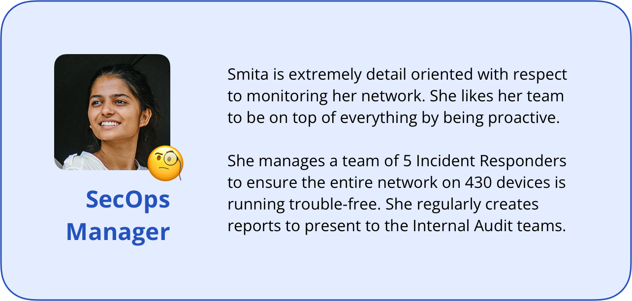
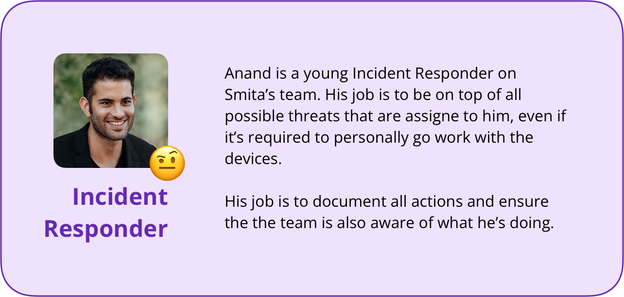
The Users
For the first version of the product, the focus was on two types of users to support the operational functioning of small SecOps teams; the SecOps Manager and Incident Responders.
In our use-case for this scope, the SecOps Manager would typically manage a network of 800-1000 devices with the help of their team of 5-6 Incident Responders (IR). IRs are typically those who actively monitor threats and user devices and, if required, physically manage devices.
Within the application, both these users would have full functionality except
1) creating new security policy/rules
2) assign tasks (active threats) to other users,
which would be reserved only for the SecOps Manager.
The Process
We kicked off the engagement with an extensive review of the problem statement, scope of work and defining the jobs-to-be-done. This helped align the team on a collective purpose and question key assumptions that were framed before the client engaged with us.
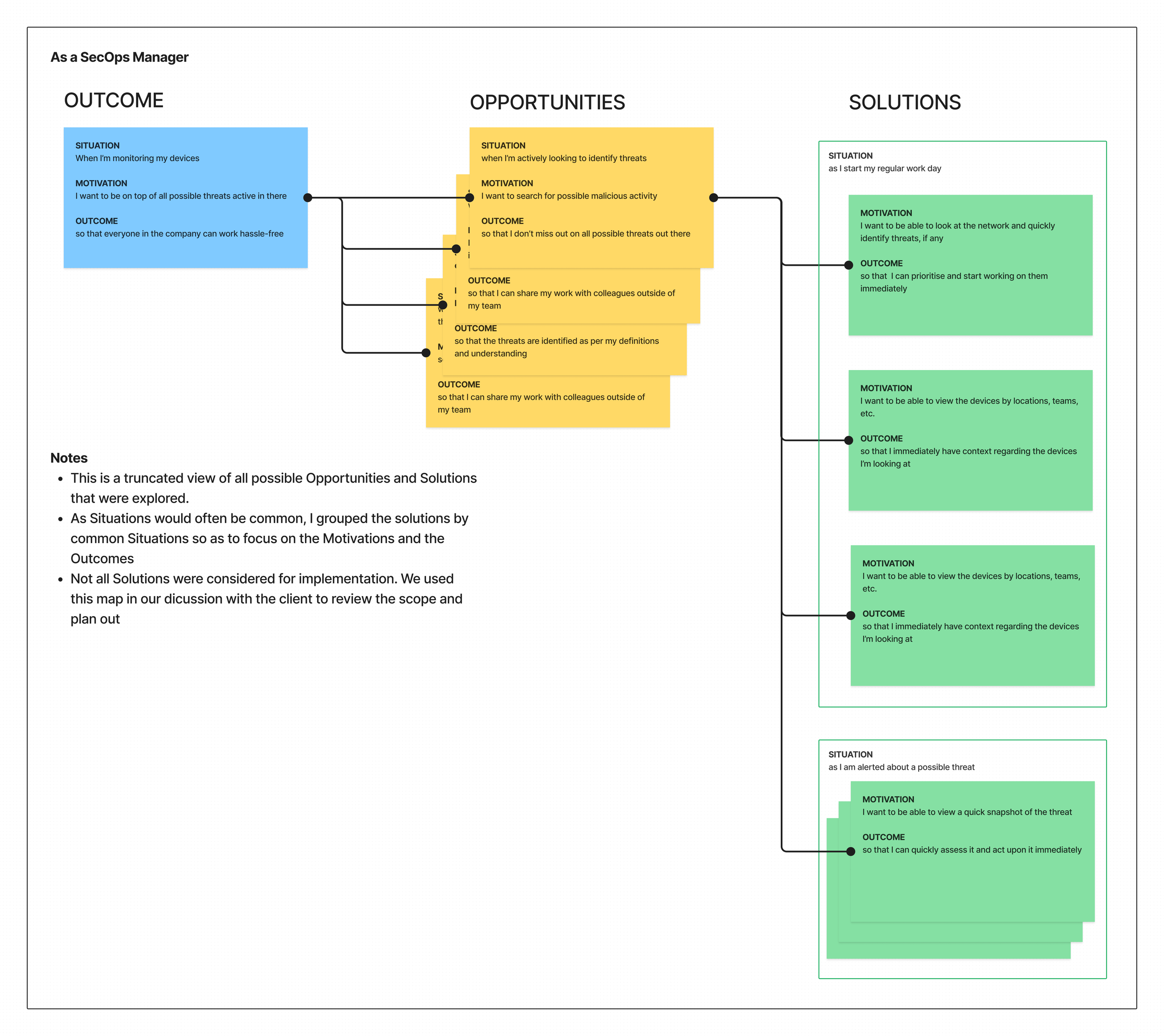
Define the primary job-to-be-done as an outcome and ideate using an Opportunity Solution Tree
We framed the opportunities as jobs-to-be-done as well and brainstormed on various solutions
Constantly ensured that we’re aligning the opportunities and solutions with the minimum functional scope as required
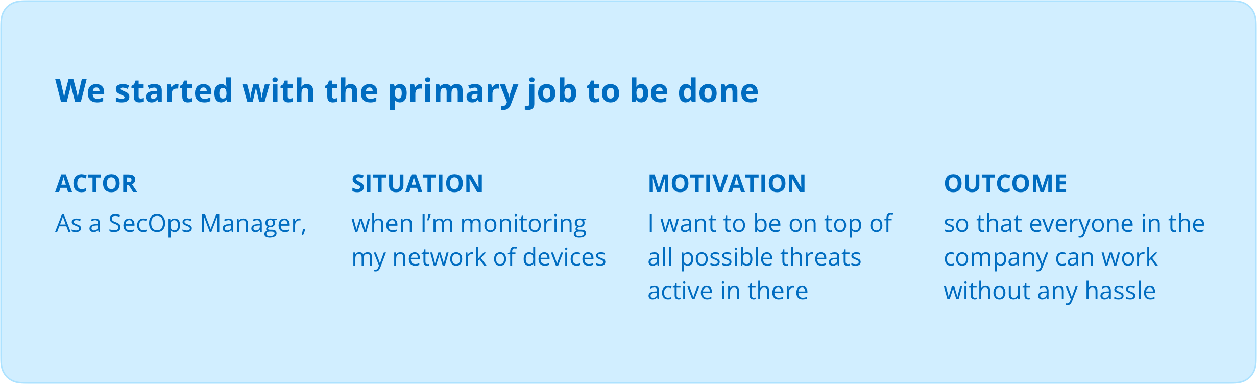
The idea behind using the Opportunity Solution Tree was to ensure the ideation was guided, aligned to our primary outcome and provided a structure to our brainstorming session. It also allowed us to question the functional scope along the way. And finally, the plan was to run an Experiment on the primary journey of Threat Analysis once we had shortlisted + prioritised a solution.
The User Journey and Information Architecture
Once we identified the jobs-to-be-done, we bucketed them into relevant stages in the user journey alongwith creating an Information Architecture of the product. I then ran a quick brainstorming session with our client team to help refine the IA and re-organise certain journeys.
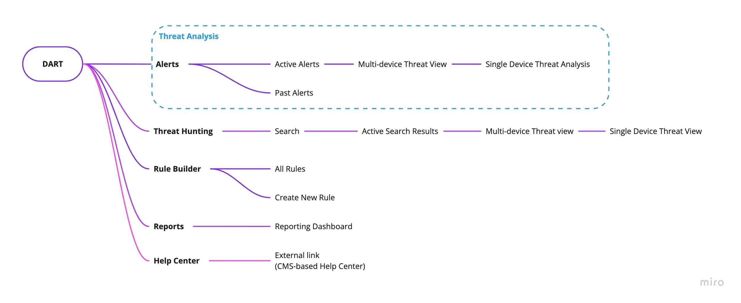
In our ideation, we explored the concept of a Threat Hunting journey where the user would proactively go hunting for possible threats that don’t have a rule created yet.
This sparked an excellent collaborative session with the client-side teams to conceptually detail out the functionality and scale to an achievable MVP level for the first version, as it would mean writing new APIs that weren’t fitting into their timeline.
I proposed the possibility of combining the Alerts and Threat Hunting journeys since they were functionally quite similar and it also allowed the navigation to be a lot simpler. We decided to not go ahead with combining them based on two assumptions;
1. As this was a substantial redesign, having Threat Hunting as a primary navigation item would create more awareness of the functionality
2. Would reduce the cognitive load on the user
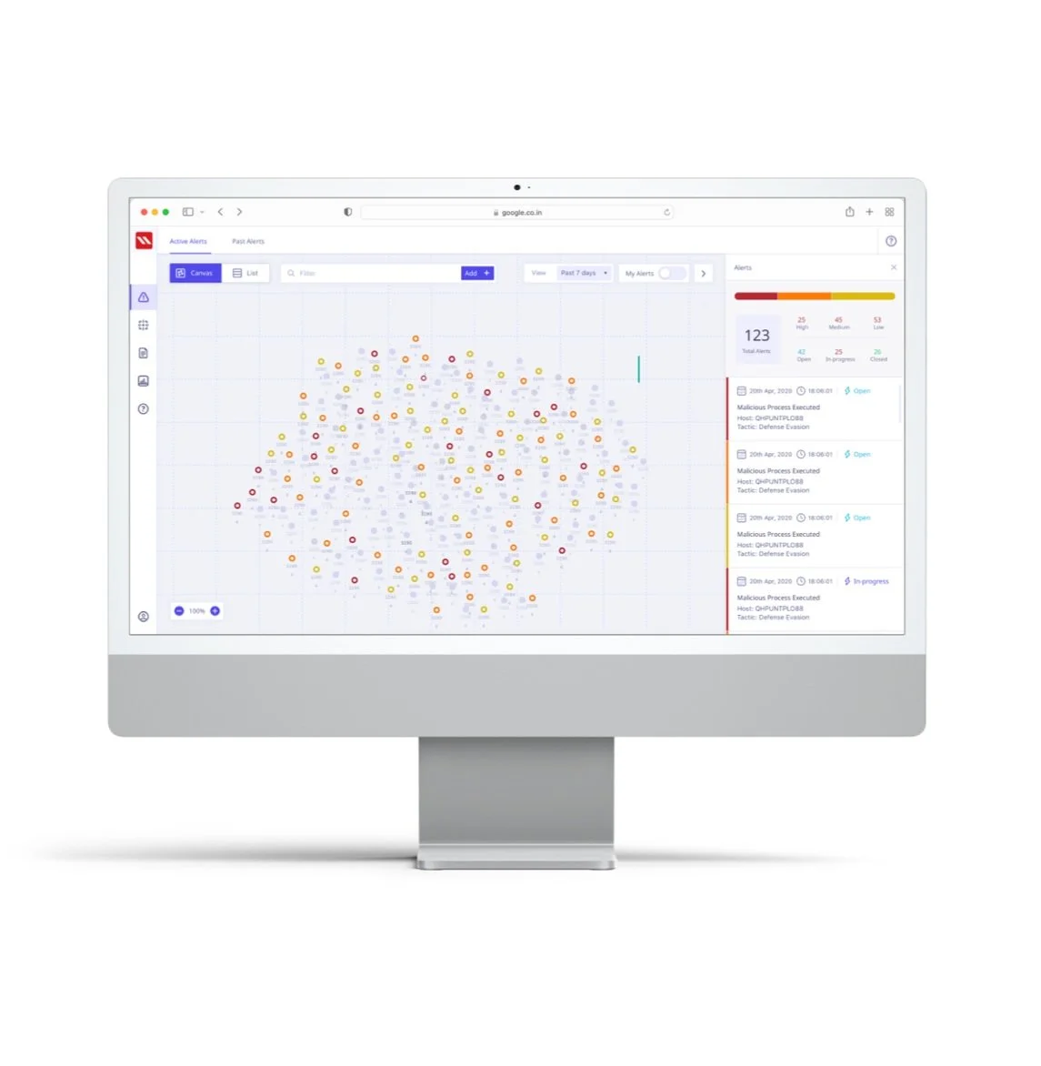
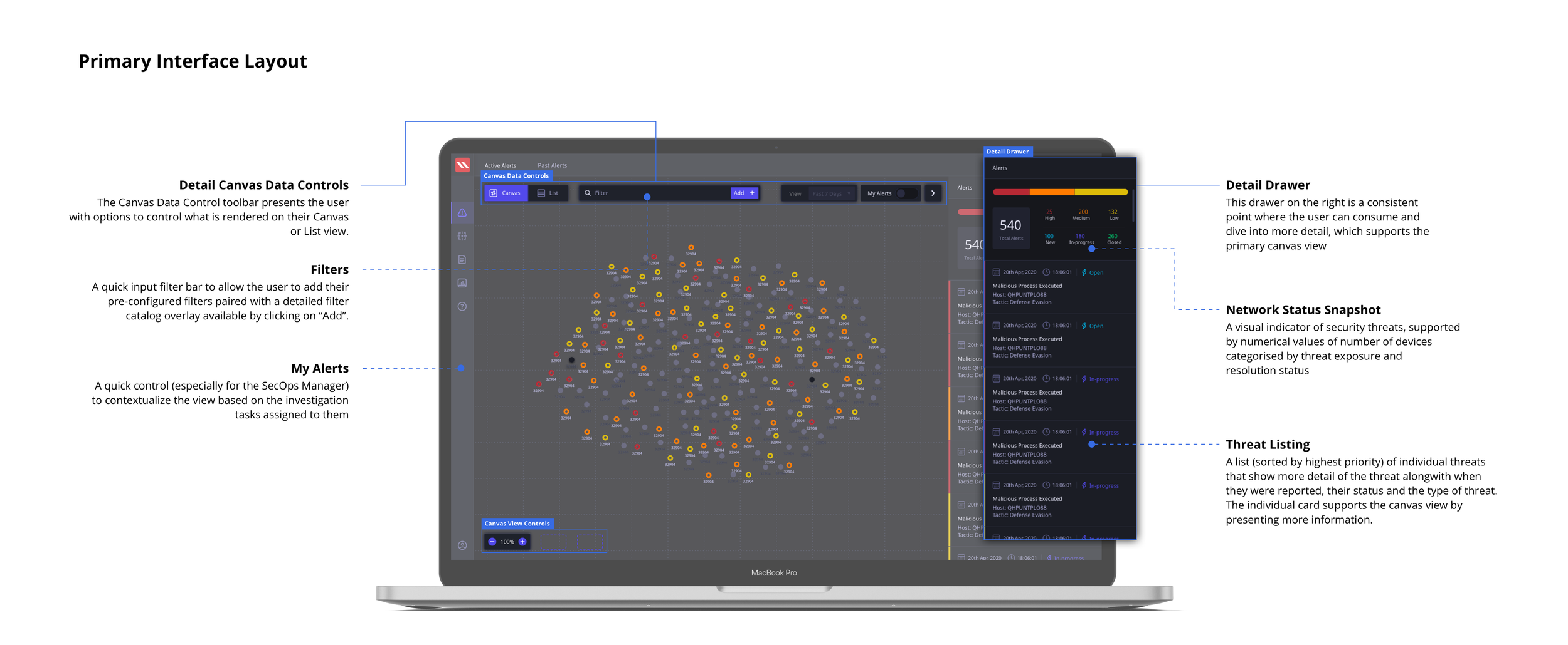
FINAL DESIGN OUTCOME: ALERTS
Reducing Dashboard fatigue by directly putting an emphasis on the current actionable status of the threats in the Network
The final Active Alerts screen that serve as a starting point in the Threat Analysis user journey tested very highly with users. We surfaced the critical metrics alongwith a visual status of the devices in the network. The devices could be viewed on a canvas as well as in a list view. The layout of the standardised screen structure is presented here below.
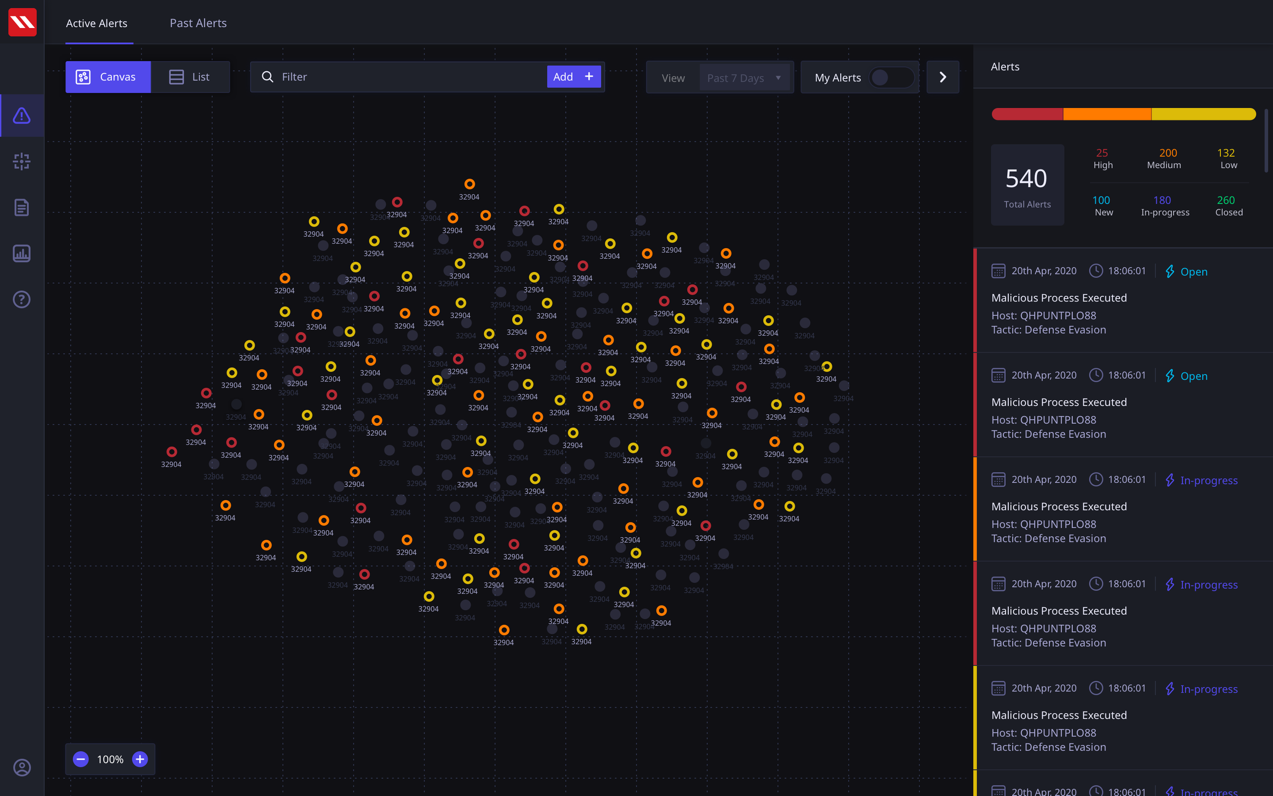
Alert Canvas View
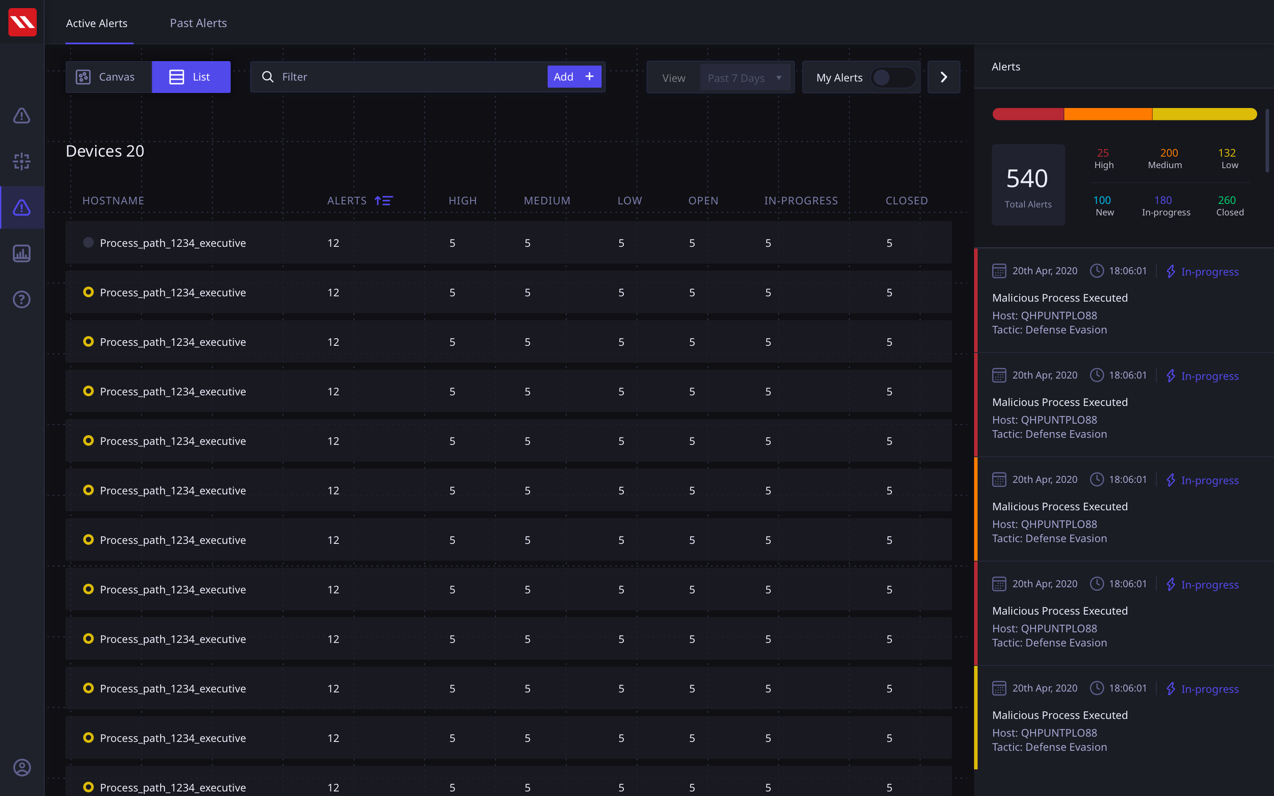
Alert List View
Alert Screen
Our concept put the Active Alerts in the front and center. This put the entire emphasis on the status of the network rather than mundane statistical data points. The user can view all assigned devices on the canvas alongwith their statuses and in the detail panel on the right, they can view Threats categorized by severity. These threats are generated by user defined rule and can span across multiple devices.
In our UT sessions, users asked for a list view of devices, as it allowed them a familiar interactive approach to filter and view their devices. We decided to incorporate this in our early version to continue testing with users post go-live, regularly evaluating the need for the view.
Multi-Threat and Multi-Device Views
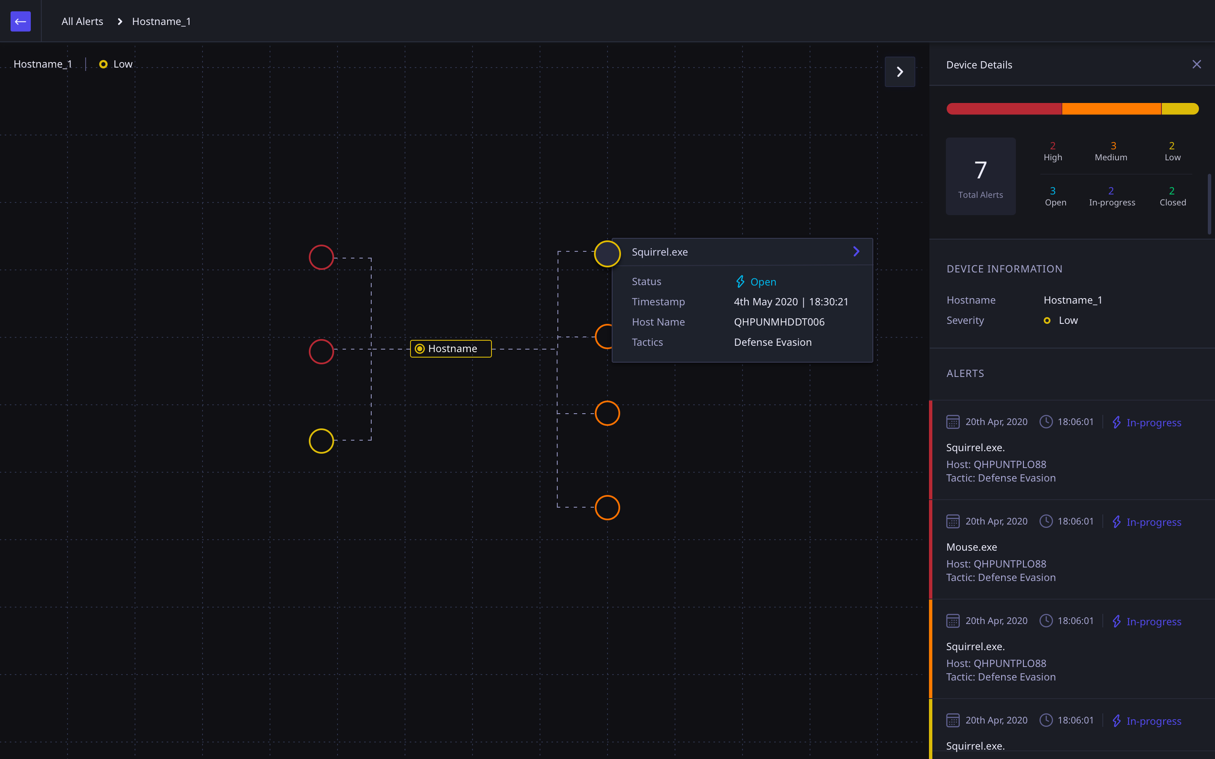
The alert view can account for a variety of scenarios of devices and threats. I modularised the concept of an Alert to be able to respond to such scenarios so that the navigation would be Alert-first and then present applicable scenarios.
At the Single Device > Single Alert view the user would be able to perform a deeper, more specific, threat analysis.
These screen show more detail of how of a threat has spread from one device to another if they are linked.
Multi-device Single Threat spread flow
Single Device Multiple Threats
Single Threat Multiple Device View
Detailed Threat Analysis
Once the user is viewing the threat at a single device, they are able to view the threat and its related activities from various perspectives and at a much deeper level. If there are multiple threats
Note: The device activity data comes from a native application installed on the user’s device.
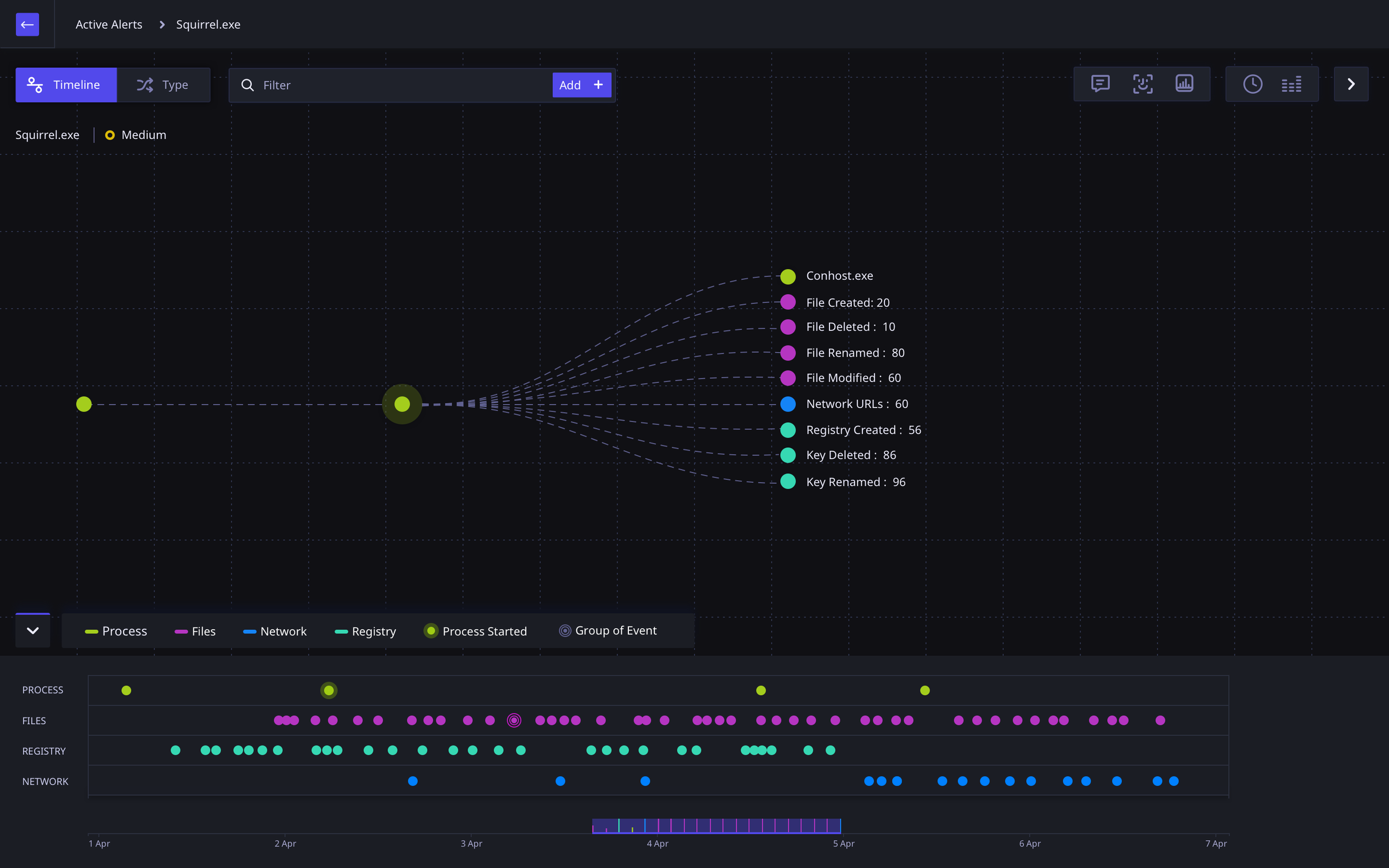
Threat Analysis Timeline View
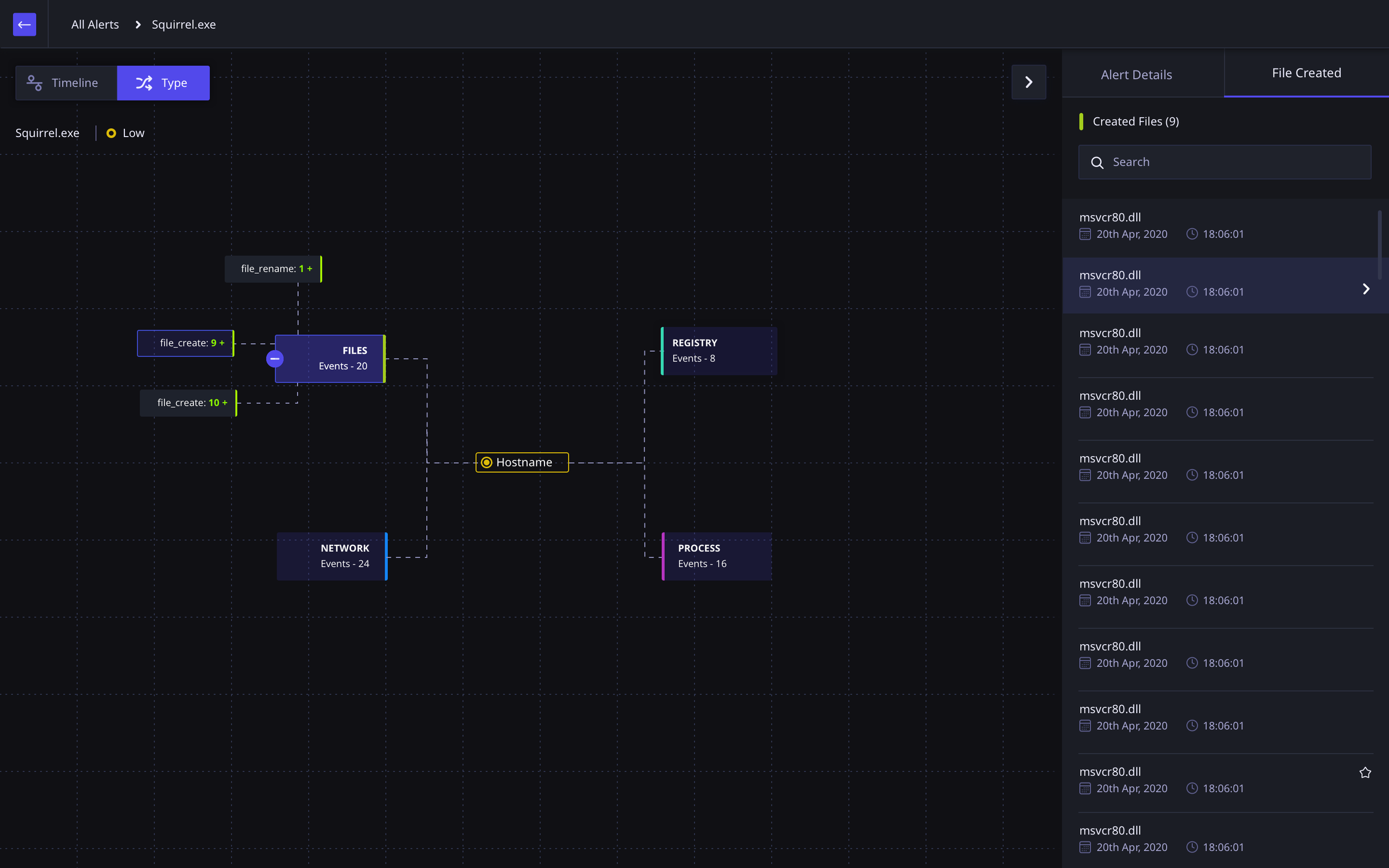
Threat Analysis Activity Type View
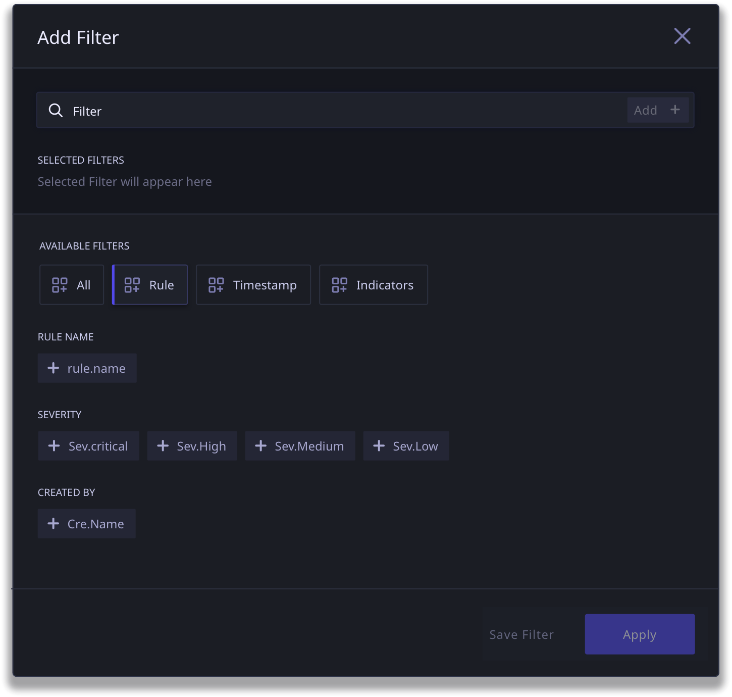
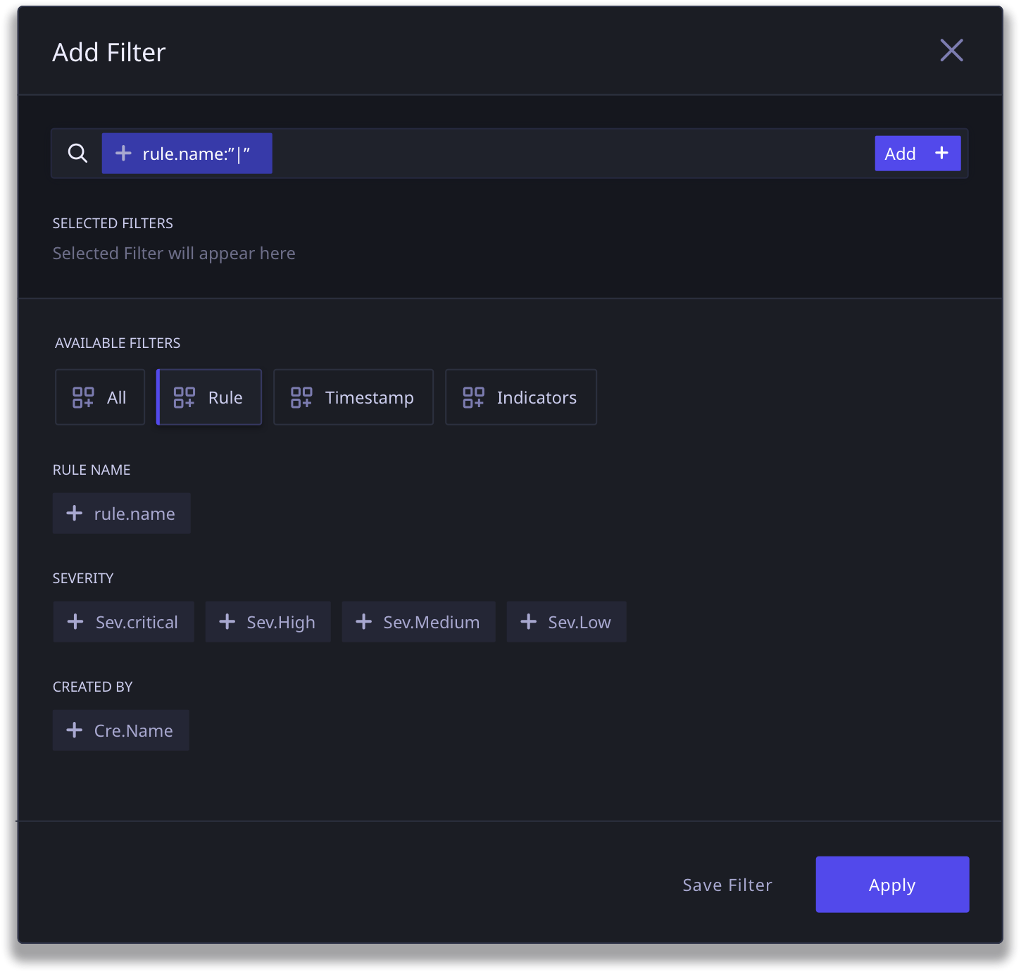
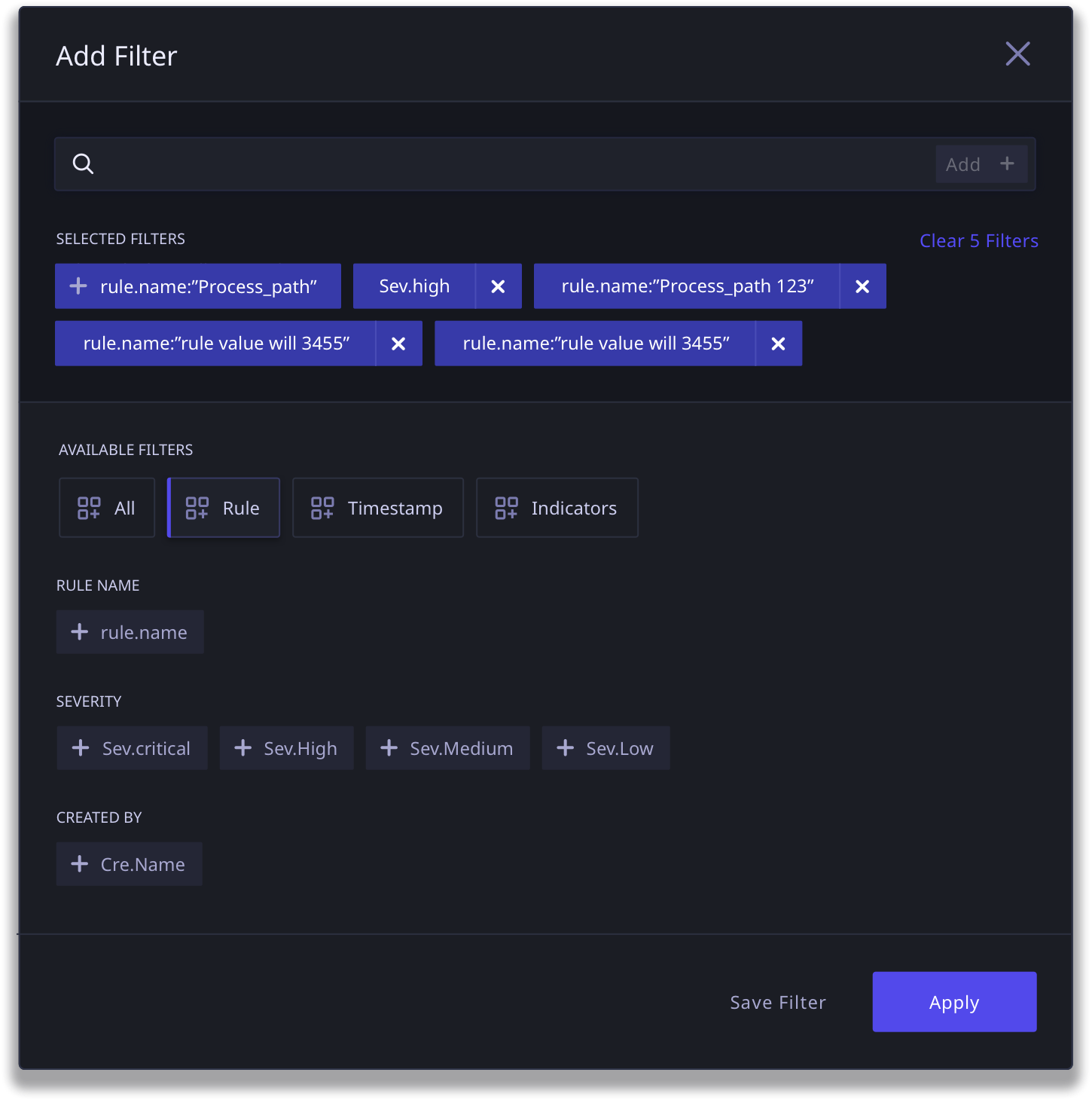
FINAL DESIGN OUTCOME: TAGS
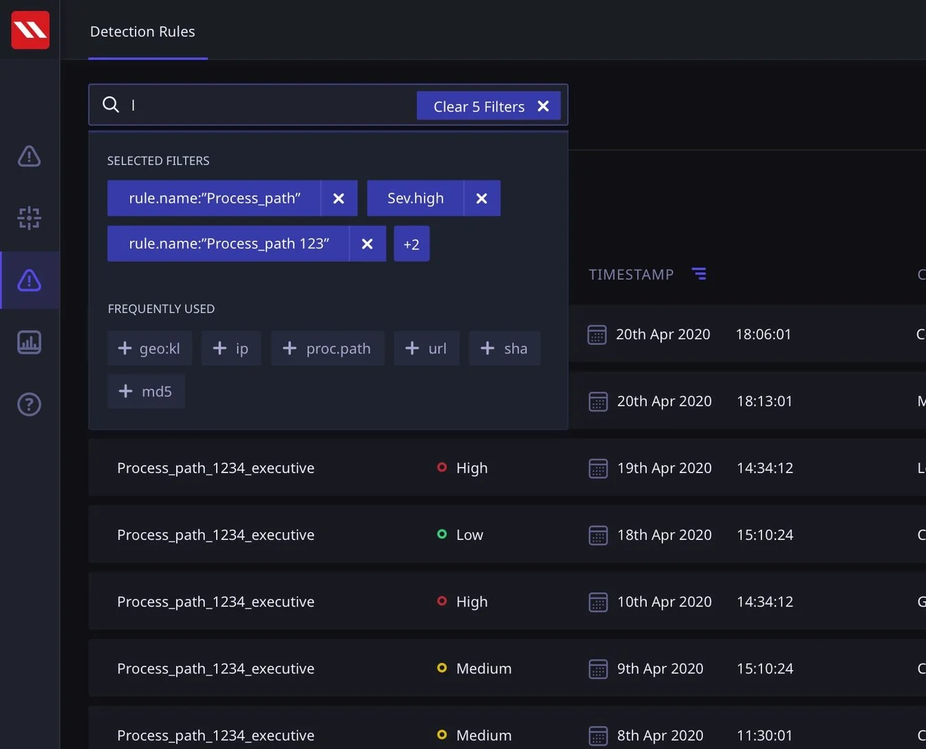
A scalable tag system that is adaptable and makes for a faster search experience and highly specific rule creation
We created a standard information tagging system that worked across threat critical journeys in the application; dashboard, threat hunting and rule creation.
This tagging system, which begins with a tag catalog, allows for complete flexibility in searching and rule definition. As the filter functionality scales, the catalog makes it easy to find relevant tags in case the user is not able to find it via type ahead.
FINAL DESIGN OUTCOME: RULE BUILDER
An enhanced Rule Building experience that leverages the new Tag System and builds on conversational parameters
We designed the Rule Builder to build off the tag system that we created for search, in order to build familiarity and consistency in the way the product is used.
Rule Builder (Click to View Larger Image)
FINAL DESIGN OUTCOME: REPORTS
The new Reports flow is a dynamic data based dashboard system that allows users to view data and usage statistics in a dynamic reporting view
As a part of the first version of DART, the users would be able to view predefined reports that give the user a view into the data in DART. With further testing and feedback post go-live, the aim was to allow the users more control over what they see and what kind of reports they would generate.
Where the previous starting point of the DART was a reporting dashboard, I proposed we create this as a separate journey to do justice to the kind of data that could be presented without the added burden of taking action upon critical tasks.
Reports View